- Topics
- Training
- Community
- Product Help
- Industry Discussions
- User Groups
- Discover
- Resources
- Intuit Accountants Community
- :
- Lacerte Tax
- :
- Lacerte Tax Discussions
- :
- Re: Notifications must be cleared *manually*?!?!?
Notifications must be cleared *manually*?!?!?
- Mark Topic as New
- Mark Topic as Read
- Float this Topic for Current User
- Bookmark
- Subscribe
- Printer Friendly Page
- Mark as New
- Bookmark
- Subscribe
- Permalink
- Report Inappropriate Content
Why exactly did the annoying colored lines of notifications (can be anywhere from one to three [1-3] lines of screen real estate that becomes LESS useful) go from a "briefly visible sidebar window which I can then close and REGAIN those three lines of screen real estate"...
...to instead become what looks like a stand-alone pop-up within which I have to:
1) click to expose the checkboxes;
2) checkbox EVERY SINGLE GODDAMN ONE OF THEM, one at a time;
3) click the "mark as read";
and then finally
4) close that dialog.
?!?!?!?!?!
At the VERY LEAST, there could be an included "check all?" box at the top?
Robert Kirk
Rockville, MD
![]() This discussion has been locked.
No new contributions can be made. You may start a new discussion
here
This discussion has been locked.
No new contributions can be made. You may start a new discussion
here
- Mark as New
- Bookmark
- Subscribe
- Permalink
- Report Inappropriate Content
From your lips to the programmers' ears!
I suspect the issue was people closing out the notifications without reading them, then calling support.
- Mark as New
- Bookmark
- Subscribe
- Permalink
- Report Inappropriate Content
I am informed that my ire is mis-placed, because there IS a "clear all" capability.
In which case it is apparently sufficiently camouflaged that it is difficult to locate, even when looking for it. So my complaint will switch from "bad program design" to "bad screen layout", both hindering effectiveness.
Now I will go look and see where this supposed tool is hiding...
Robert
- Mark as New
- Bookmark
- Subscribe
- Permalink
- Report Inappropriate Content
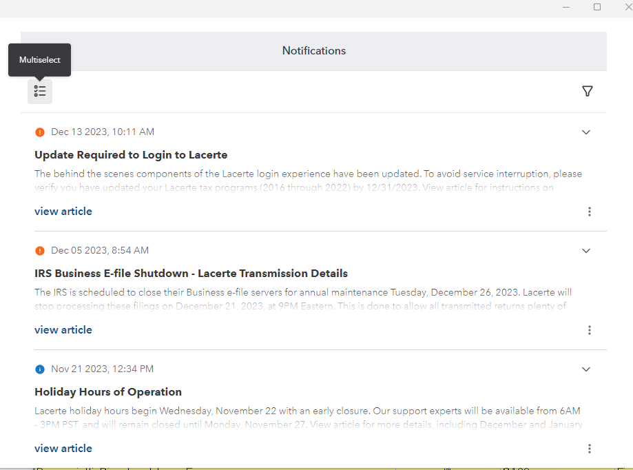
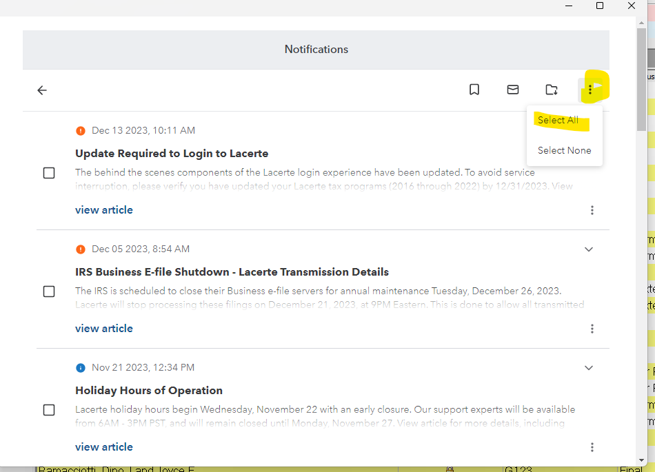
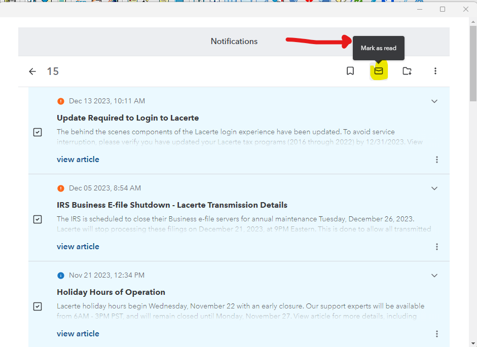
You don't have to click on each one. You can click on the Multi-Select (top left of notifications window) then click the three dots on the right and choose select all, then click the mark read mail icon looking button to mark them all as being read.
(plagiarized from a different list-serve - and it does work - STILL extra steps to go thru tho, thus complicating tax season just a wee bit more)
- Mark as New
- Bookmark
- Subscribe
- Permalink
- Report Inappropriate Content
Notifications definitely took a turn for the worse this year (Tax Year 2022). I really hope they can recover from their error and go back to a more useful notifications dialog box. It is very difficult to use at this point and does not show more than 3 past notifications. Therefore I will be avoiding the use of it until it is fixed.
- Mark as New
- Bookmark
- Subscribe
- Permalink
- Report Inappropriate Content
hey @Grandmaster we appreciate you reaching out and giving feedback. Please share your feedback in the Lacerte Tax Idea Exchange Forum and encourage people to comment and vote!
- Mark as New
- Bookmark
- Subscribe
- Permalink
- Report Inappropriate Content
I cannot clear the red and blue notifications. How do I clear them?
- Mark as New
- Bookmark
- Subscribe
- Permalink
- Report Inappropriate Content
See my answer from 'months' ago:
You don't have to click on each one. You can click on the Multi-Select (top left of notifications window) then click the three dots on the right and choose select all, then click the mark read mail icon looking button to mark them all as being read.
(plagiarized from a different list-serve - and it does work - STILL extra steps to go thru tho, thus complicating tax season just a wee bit more)
- Mark as New
- Bookmark
- Subscribe
- Permalink
- Report Inappropriate Content
Thanks, abctax55, but I tried following your directions, and the GD lines won't go away.
I also closed the program and re-opened, but they are still there.
- Mark as New
- Bookmark
- Subscribe
- Permalink
- Report Inappropriate Content
😃 It's as easy as 1 - 2- 3
1 - Mouse over the thingie in the upper left and click to get to 2
2 - Hover over the 3 dots in the upper right and click to be able to Select All
3 - Click the ✉️ (not as colorful envelope emoji) to Mark as Read Folder to Archive (Even I got this wrong. I can't even follow my own 1-2-3s ) SORRY don't take the image as being totally correct.
SEE? Easy Peasy.
Answers are easy. Questions are hard!
- Mark as New
- Bookmark
- Subscribe
- Permalink
- Report Inappropriate Content
Maybe @George4Tacks detailed answer will help you as what I suggested does work for me.
Good luck
- Mark as New
- Bookmark
- Subscribe
- Permalink
- Report Inappropriate Content
Thank you-this has been annoying; did not know there was a dismiss to get rid of them and yes every one you had to go through
- Mark as New
- Bookmark
- Subscribe
- Permalink
- Report Inappropriate Content
It used to be "click on <any of the lines> to open the side-screen panel, and then click to close that panel WHICH MARKED THEM ALL AS READ because you had the reading panel open at some point."
Two clicks, and you re-gained 10% of your Client List view-space.
Yeah, not understanding why this needed to be done.
