- Topics
- Training
- Community
- Product Help
- Industry Discussions
- User Groups
- Discover
- Resources
- Intuit Accountants Community
- :
- ProSeries Tax
- :
- ProSeries Tax Discussions
- :
- Pop-up boxes are not needed
Pop-up boxes are not needed
- Mark Topic as New
- Mark Topic as Read
- Float this Topic for Current User
- Bookmark
- Subscribe
- Printer Friendly Page
- Mark as New
- Bookmark
- Subscribe
- Permalink
- Report Inappropriate Content
You can't efile with errors already highlighted in pink. I greatly use the pink errors and also the yellow error triangle icon at the top. It was countered last year that it never hurts to have an extra layer of error checking, but the boxes do slow me down, do not in reality provide protection, and are just an unnecessary annoyance. The one place I wish I had error protection (other than the efiling bouncing back) is in Virginia when I neglect to put in the date for withdrawal of tax.
- Mark as New
- Bookmark
- Subscribe
- Permalink
- Report Inappropriate Content
So VA lets you choose Direct Debit, but doesn't insist you fill in a withdrawal date?
Thats a weird one, you'd expect that date box to light up pink until you enter a date.
♪♫•*¨*•.¸¸♥Lisa♥¸¸.•*¨*•♫♪
- Mark as New
- Bookmark
- Subscribe
- Permalink
- Report Inappropriate Content
Precisely my point: In Virginia, no pink, no error message per yellow triangle icon! The only way to be reminded of the error is to have the efiling rejected. No box pop-up box either...
BTW if every error had a pop-up box, I'd close up shop. How do they select which errors deserve a pop-up box?
- Mark as New
- Bookmark
- Subscribe
- Permalink
- Report Inappropriate Content
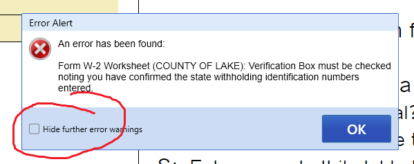
I shut off those popup boxes after the first one hits in a W2 to verify the state ID number...it doesn't even let me get to the dang box before it pops up nagging me! So I always hit the checkbox on that popup window to not show me again and no more popup boxes appear until the next time I restart the program.
But those pink boxes, tell us when a spot needs to be filled in, I use those a lot! Weird that they missed it for the VA Direct Debit Date...I know it lights up pink for Federal and CA does as well.
♪♫•*¨*•.¸¸♥Lisa♥¸¸.•*¨*•♫♪
- Mark as New
- Bookmark
- Subscribe
- Permalink
- Report Inappropriate Content
I too have 'trained' myself to check the pink box for State ID number before the dreaded pop-up appears. But is there really a box to check to turn off the pop-ups? Where? (I wish they would give us the option to block all pop-ups.)
- Mark as New
- Bookmark
- Subscribe
- Permalink
- Report Inappropriate Content
The first one that pops up for the day, I check this box and I dont see anymore until the next time I restart the program
♪♫•*¨*•.¸¸♥Lisa♥¸¸.•*¨*•♫♪


